If you read my posts on Facebook, you’ve probably heard there’s an exhibit of my work at the Green Sage Coffee House and Cafe in South Asheville. This is one of two Green Sage restaurants in Asheville, and there’s a third scheduled to open at the Westgate Shopping Center this summer.
This first photo was taken on the evening of April 1, when we hung the prints. The lighting and the gallery hanging system they use show that they take the art that goes on their walls very seriously. And get this – they only display work by photographers! So of course I am delighted to have my prints exhibited there through June 30.
My first piece sold on April 19. It’s the one at the far right.
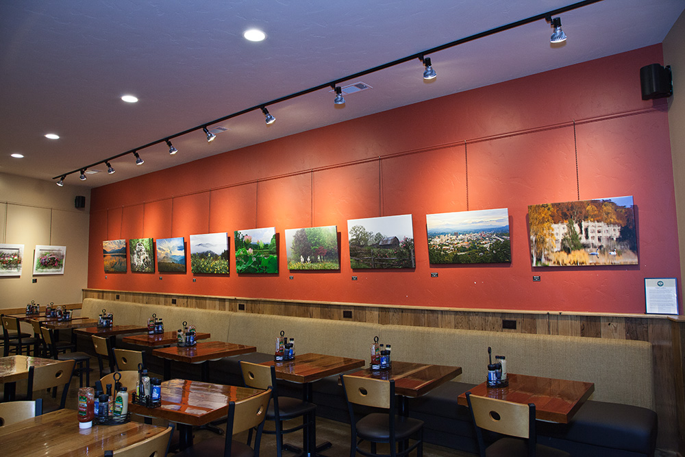
The Green Sage Coffee House and Cafe in South Asheville
Here’s the closeup, titled Reflective Moment at Lake Susan.
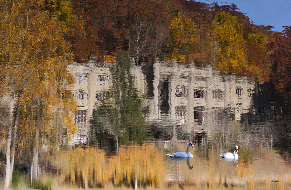
Reflective Moment at Lake Susan (Montreat, NC)
Selling this one first was special to me, for a number of reasons:
- I really like the good people from New York City who purchased it.
- It’s the most “recent” piece and stood out among some proven sellers. I put recent in quotes because I clicked the shutter more than eight years ago. But that’s a mere technicality: the concept and all the computer processing and printing (which I did myself) are new – ergo, recent work.
- Quite a bit of time and effort went into it (and it will probably get tweaked more).
You may be interested in the steps I went through to create the image. Or you may prefer to just look at photos. (I have tried to keep the word count down.)
The Setting
Tiny Lake Susan is in Montreat, NC., a small town next door to the larger and better known small town of Black Mountain. The next photo shows about 80 to 90 percent of the lake on a beautiful fall day. The large, European-style stone building at the left is Assembly Inn. Note the two white swans near the footbridge on the far side of the lake. And the mountains in the distance!
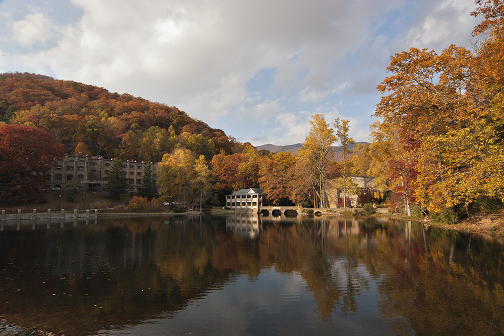
Lake Susan at Montreat, NC
The next photo features Father Christmas and his wife, who were visiting that day and were kind enough to stop and pose for me. If I could locate them, I’d send them a print.
Before you move on, let me call your attention to the brightly colored paddle boats and canoes that clash with the more subdued tones of, well, everything else in the image. Now scroll up to the previous photo that was taken a minute and half after this one. . . . Having those aesthetically offensive boats gone makes me feel sooo much better! Took about a minute, using Photoshop’s Spot Healing Brush Tool.*
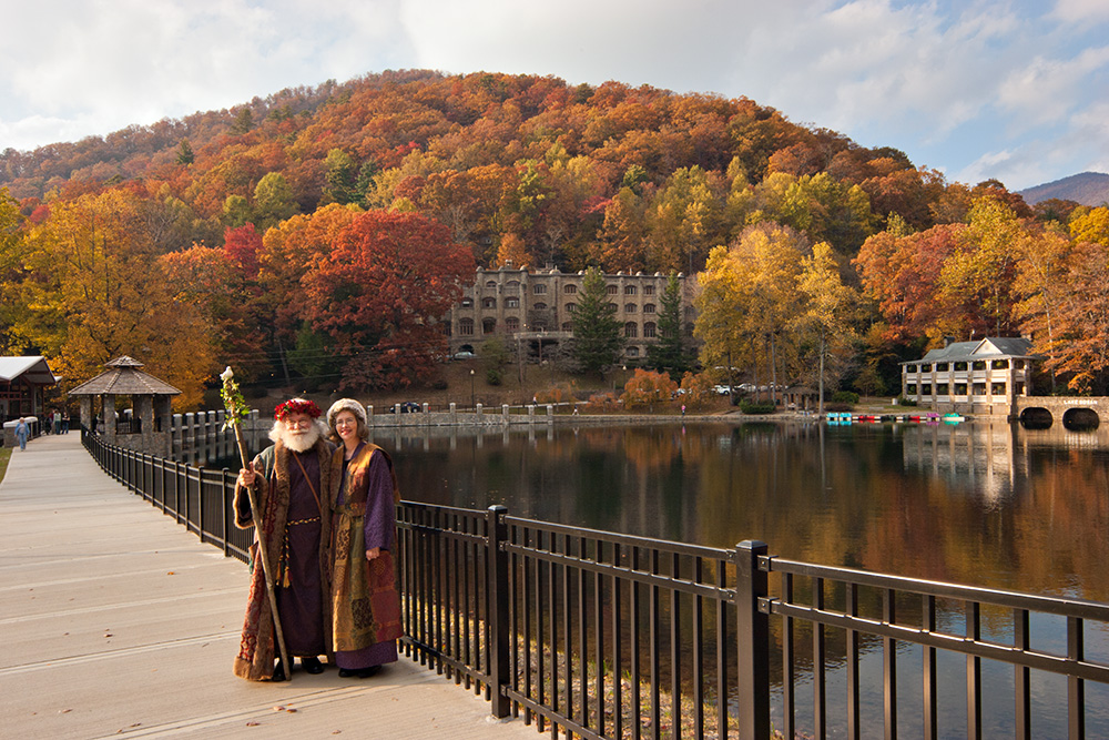
Father Christmas and Spouse
That was all the photography I had time for that day; but the vibrant fall colors and the tranquil setting had worked their spell, bringing me back just two days later.
As you’ll see, I was not disappointed. Here’s one of the reflection of Assembly Inn taken from the opposite side of the lake. I love the late-fall colors and fascinating architecture, but it is upside down . . .
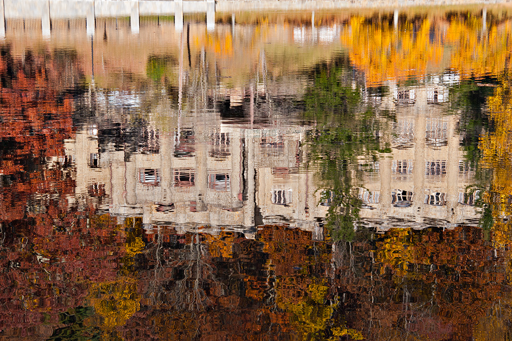
Assembly Inn Reflected in Lake Susan
There, now it looks kind of impressionistic. Except for the rotation, this is exactly as I shot it – no cropping or any other manipulation. (Note to self: consider doing something with this one.)
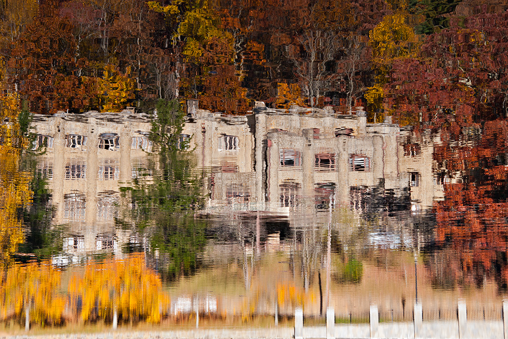
That’s more like it!
Next is another shot taken from the same location a few minutes later. I couldn’t have positioned the swans any better if they were remotely controlled. I guess the spirit of Father Christmas was with me.
Still, the picture doesn’t stand on its own like this, mainly because most of what’s interesting about it is upside down. And the top portion is, frankly, kind of junky looking, with the cars, paddle boats and canoe, and other distractions. So the question, as always, is this: Can the image be made more appealing? There’s certainly enough there to make it worth a try.
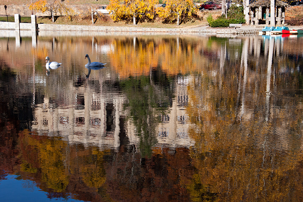
White Swans Show Up Right on Cue
So let’s see how it looks when it’s flipped.
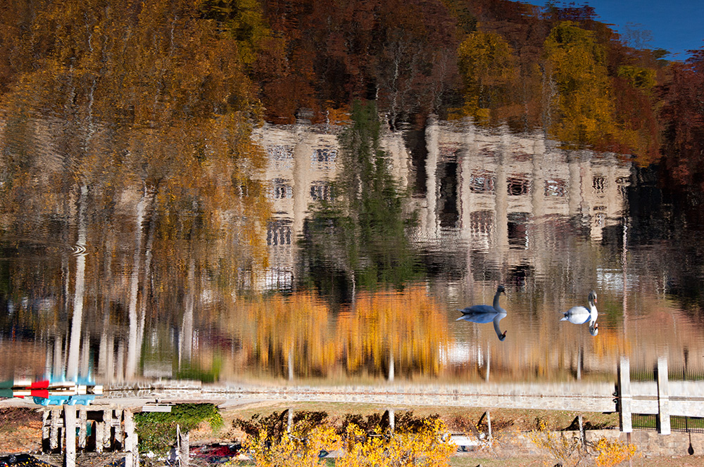
Step 1
Much more promising, in my view, but still needs work – severe cropping, for one thing. Also, there’s something wrong with the swans that may not be immediately apparent. They’re supposed to be swimming (floating/paddling) on the surface, and yet they’re darker than their reflections in the water. That’s because the real swans and their reflections are reversed now. So I’ve got to rotate those guys, using one or more of Photoshop’s selection tools.
By this time I realized that if the image was going to have the intended impressionistic effect, I’d have to get rid of everything that made it too obvious that it was a just a reflection. The idea wasn’t to pass it off as a painting; I just wanted it to look like it might be a painting, to create that impression long enough to pique the viewer’s curiosity. The world of art is one place where ambiguity is not only acceptable but often desirable.
It took a while to determine that all signs of the wall and fence in the foreground would have to go, as would the pole on the right along with several other distractions in the water. And especially those paddle boats and the canoe.
Those alterations took a fair amount of time and some trial and error, but my trusty old partner, Photoshop, didn’t let me down. (Whenever I start thinking I’m pretty good at Photoshop, I always remind myself that I’m just scratching the surface.)
Final Image (for now)
So there you have it, Anatomy of an Image.
If I were a painter, which I’m not, I wouldn’t paint it exactly like that, but maybe pretty close.
I would love to hear your comments and suggestions; and please let me know if you would like me to post more of these show-and-tells. I sure enjoyed doing this one!
* Some readers may object to that kind of Photoshopping. For now, I’ll just say I’ve thought about it and come to a position with which I’m comfortable. It mostly comes down to the intended use of the image. I’ll discuss the issue in more detail in a future post, probably next time.